Chapter with code
import pandas as pd
import matplotlib.pyplot as plt
Prepare data
See also:
All the commands used here are described in the pandas documentation
First load a dataset from github:
data = pd.read_csv('https://github.com/jenfly/opsd/raw/master/opsd_germany_daily.csv')
And take a look:
data
| Date | Consumption | Wind | Solar | Wind+Solar | |
|---|---|---|---|---|---|
| 0 | 2006-01-01 | 1069.18400 | NaN | NaN | NaN |
| 1 | 2006-01-02 | 1380.52100 | NaN | NaN | NaN |
| 2 | 2006-01-03 | 1442.53300 | NaN | NaN | NaN |
| 3 | 2006-01-04 | 1457.21700 | NaN | NaN | NaN |
| 4 | 2006-01-05 | 1477.13100 | NaN | NaN | NaN |
| ... | ... | ... | ... | ... | ... |
| 4378 | 2017-12-27 | 1263.94091 | 394.507 | 16.530 | 411.037 |
| 4379 | 2017-12-28 | 1299.86398 | 506.424 | 14.162 | 520.586 |
| 4380 | 2017-12-29 | 1295.08753 | 584.277 | 29.854 | 614.131 |
| 4381 | 2017-12-30 | 1215.44897 | 721.247 | 7.467 | 728.714 |
| 4382 | 2017-12-31 | 1107.11488 | 721.176 | 19.980 | 741.156 |
4383 rows × 5 columns
data.dtypes
Date            object
Consumption    float64
Wind           float64
Solar          float64
Wind+Solar     float64
dtype: object
Let’s make the Date column to a datetime
data['Date'] = pd.to_datetime(data['Date'])
And set it as the index:
data.set_index('Date', inplace=True)
data
| Consumption | Wind | Solar | Wind+Solar | |
|---|---|---|---|---|
| Date | ||||
| 2006-01-01 | 1069.18400 | NaN | NaN | NaN |
| 2006-01-02 | 1380.52100 | NaN | NaN | NaN |
| 2006-01-03 | 1442.53300 | NaN | NaN | NaN |
| 2006-01-04 | 1457.21700 | NaN | NaN | NaN |
| 2006-01-05 | 1477.13100 | NaN | NaN | NaN |
| ... | ... | ... | ... | ... |
| 2017-12-27 | 1263.94091 | 394.507 | 16.530 | 411.037 |
| 2017-12-28 | 1299.86398 | 506.424 | 14.162 | 520.586 |
| 2017-12-29 | 1295.08753 | 584.277 | 29.854 | 614.131 |
| 2017-12-30 | 1215.44897 | 721.247 | 7.467 | 728.714 |
| 2017-12-31 | 1107.11488 | 721.176 | 19.980 | 741.156 |
4383 rows × 4 columns
What are the units? See here: it’s \(GWh\).
Rename columns accordingly:
data.rename(axis=1, mapper={col: col+' [GWh]' for col in data.columns}, inplace=True)
data
| Consumption [GWh] | Wind [GWh] | Solar [GWh] | Wind+Solar [GWh] | |
|---|---|---|---|---|
| Date | ||||
| 2006-01-01 | 1069.18400 | NaN | NaN | NaN |
| 2006-01-02 | 1380.52100 | NaN | NaN | NaN |
| 2006-01-03 | 1442.53300 | NaN | NaN | NaN |
| 2006-01-04 | 1457.21700 | NaN | NaN | NaN |
| 2006-01-05 | 1477.13100 | NaN | NaN | NaN |
| ... | ... | ... | ... | ... |
| 2017-12-27 | 1263.94091 | 394.507 | 16.530 | 411.037 |
| 2017-12-28 | 1299.86398 | 506.424 | 14.162 | 520.586 |
| 2017-12-29 | 1295.08753 | 584.277 | 29.854 | 614.131 |
| 2017-12-30 | 1215.44897 | 721.247 | 7.467 | 728.714 |
| 2017-12-31 | 1107.11488 | 721.176 | 19.980 | 741.156 |
4383 rows × 4 columns
Looks fine.
Examine data
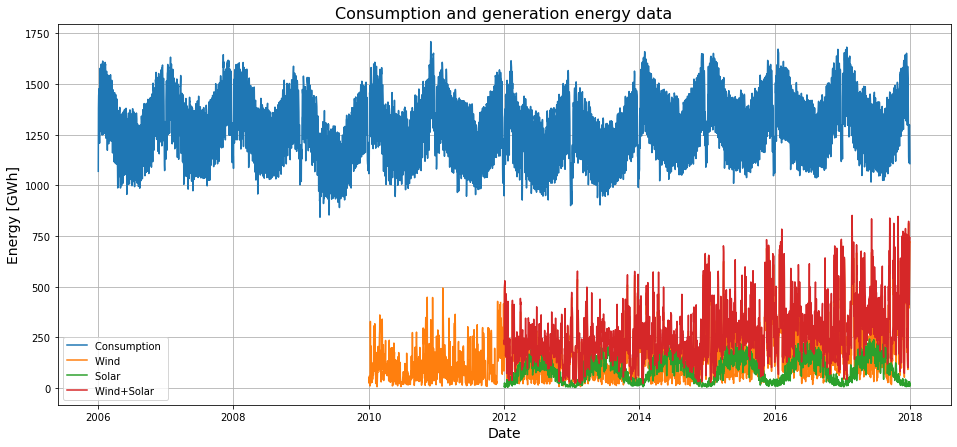
Now let’s have a look at a plot:
plt.figure(figsize=(16,7))
for col in data.columns:
    plt.plot(data[col], label=col.rstrip('[GWh]'))
plt.title('Consumption and generation energy data',fontsize=16)
plt.xlabel('Date', fontsize=14)
plt.ylabel('Energy [GWh]', fontsize=14)
plt.grid()
plt.legend();
Total energy consumption
How much energy was consumed each year?
data['year'] = data.index.year
# divide by 1000 => TWh
consumptions_years = data.groupby(axis=0, by='year').sum()/1000
# rename columns accordingly
consumptions_years.rename(axis=1, mapper={col: col.replace('GWh', 'TWh') for col in data.columns},
                          inplace=True)
plt.figure(figsize=(16,7))
plt.bar(x=consumptions_years.index, height=consumptions_years[consumptions_years.columns[0]])
plt.title('Consumption energy data',fontsize=16)
plt.xlabel('Date', fontsize=14)
plt.ylabel('Energy [TWh]', fontsize=14)
plt.grid()
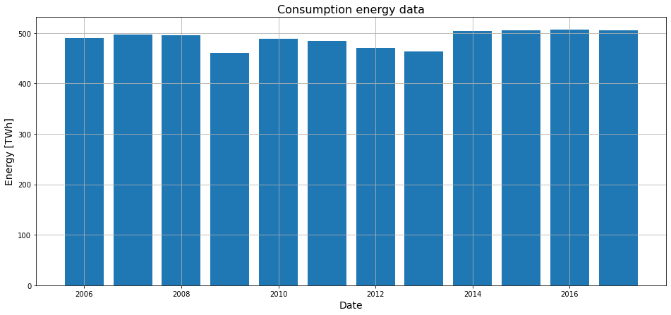
About the same each year
See also
Website of the Umweltbundesamt
Website of SMARD
How is the consumption for one year?
plt.figure(figsize=(16,7))
plt.plot(data.loc['2017', 'Consumption [GWh]'], '-x')
plt.title('Consumption energy data',fontsize=16)
plt.xlabel('Date', fontsize=14)
plt.ylabel('Energy [GWh]', fontsize=14)
plt.grid()
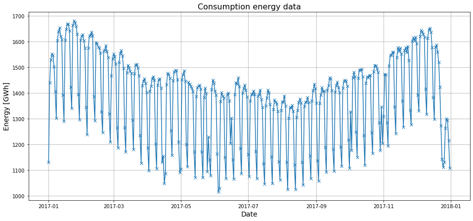
Looks like 52 weeks a year, with the weekends having lower demand.
Look for the mean consumtion per weekday:
data2017daily = pd.DataFrame(data.loc['2017', 'Consumption [GWh]'])
data2017daily['day'] = data2017daily.index.weekday

# mean for the weekdays
data2017dailyGrouped = data2017daily.groupby(axis=0, by='day').mean()
plt.figure(figsize=(16,7))
plt.bar(x=data2017dailyGrouped.index, height=data2017dailyGrouped['Consumption [GWh]'])
plt.title('Consumption energy data',fontsize=16)
plt.xlabel('Date', fontsize=14)
plt.ylabel('Energy [GWh]', fontsize=14)
plt.grid()
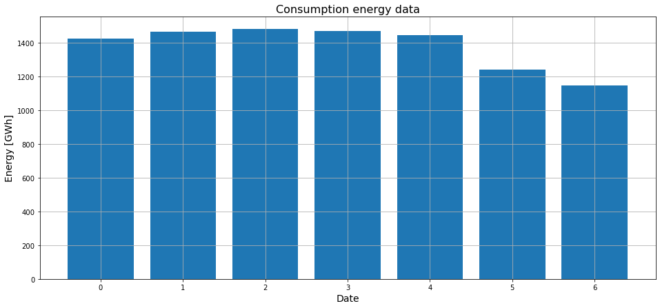
Hint
Numbers 0 to 6 represent the weekdays monday to sunday (see pandas)
Confirmed: weekends have lower consumption.
Total energy generation by renewables
how much energy was produced each year?
bw = 0.35
plt.figure(figsize=(16,7))
plt.bar(x=consumptions_years.index-bw/2, height=consumptions_years[consumptions_years.columns[1]], label='wind',
       width=bw)
plt.bar(x=consumptions_years.index+bw/2, height=consumptions_years[consumptions_years.columns[2]], label='solar',
       width=bw)

plt.title('Generation energy data',fontsize=16)
plt.xlabel('Date', fontsize=14)
plt.ylabel('Energy [TWh]', fontsize=14)
plt.grid()
plt.legend();
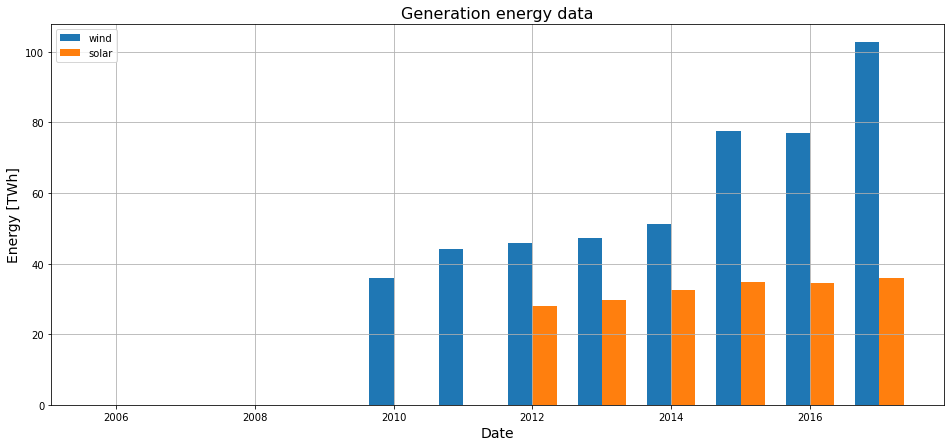
Info
There was already generation by renewables before 2010, there is just no data provided in the dataset
Significant rise in generation by windpower since 2014, only slow rise in generation by pv.